Clarendon Type Specimen
Poster
Goal
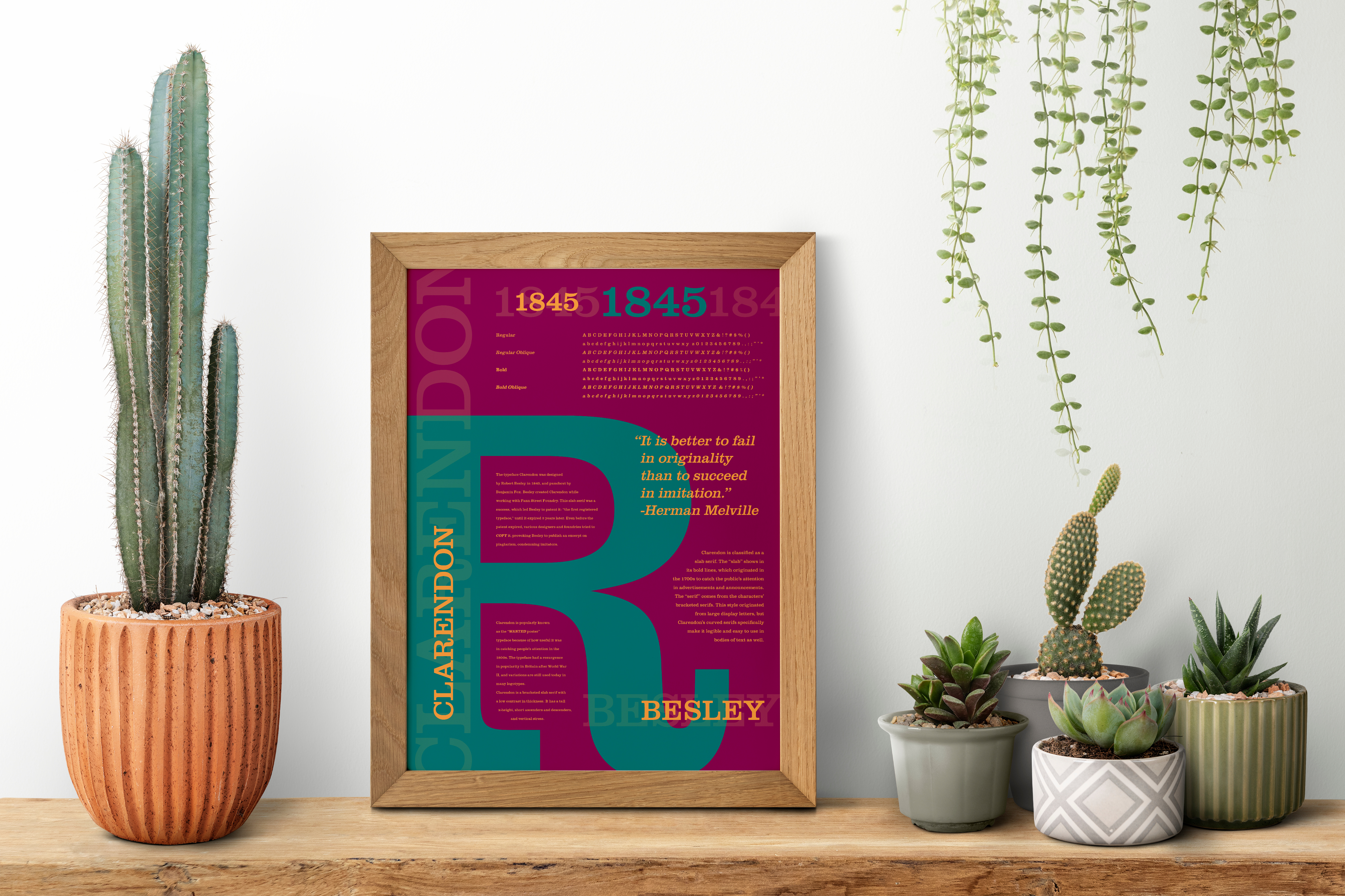
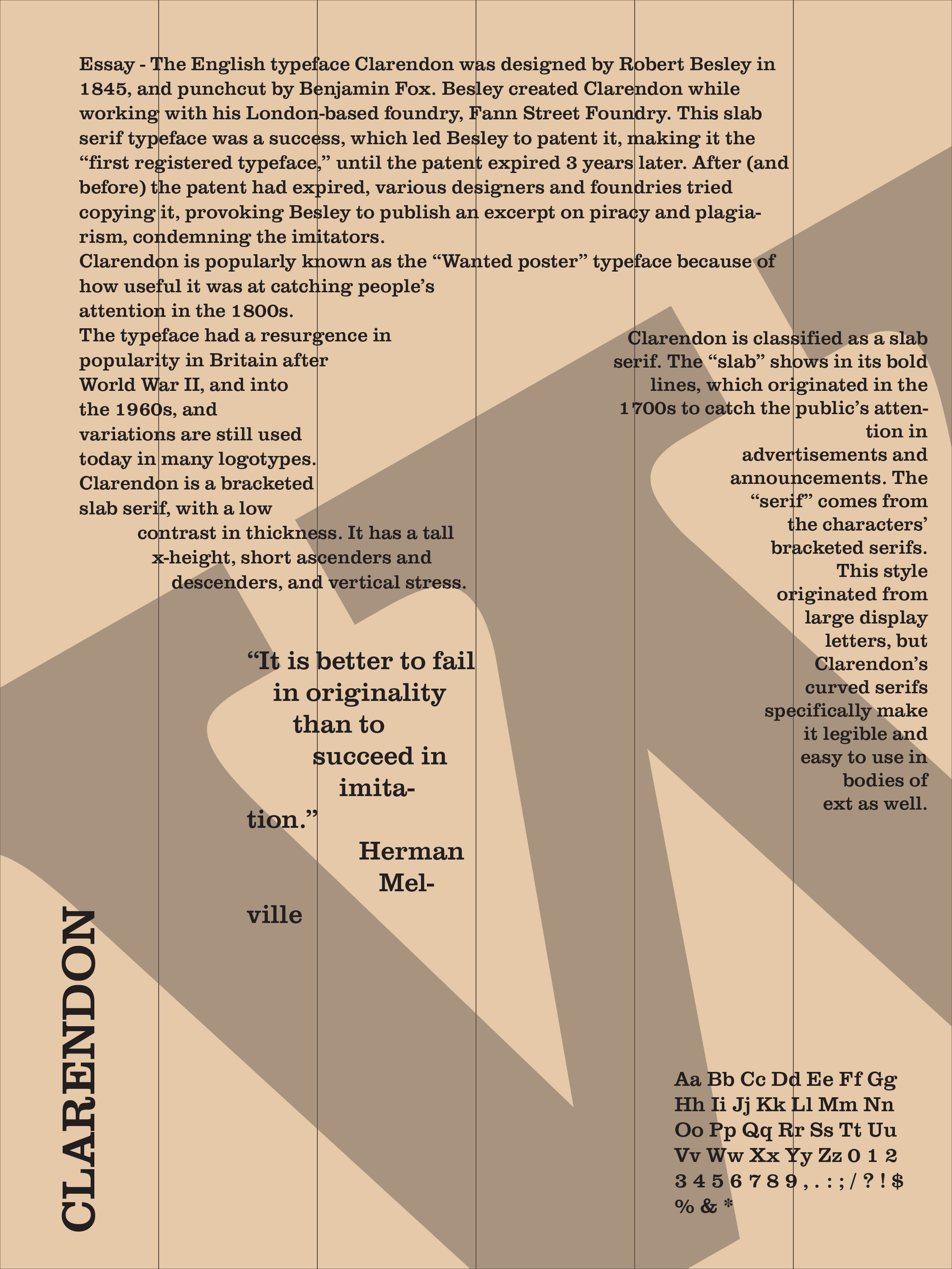
This project was simple: make a type specimen for Clarendon. I was tasked with showcasing the different fonts that Clarendon has to offer, its history, and its creator's history.
Limitations
With the main focus being the type, I was not allowed to add images, shapes, or textures to the specimen.
Process and Solution
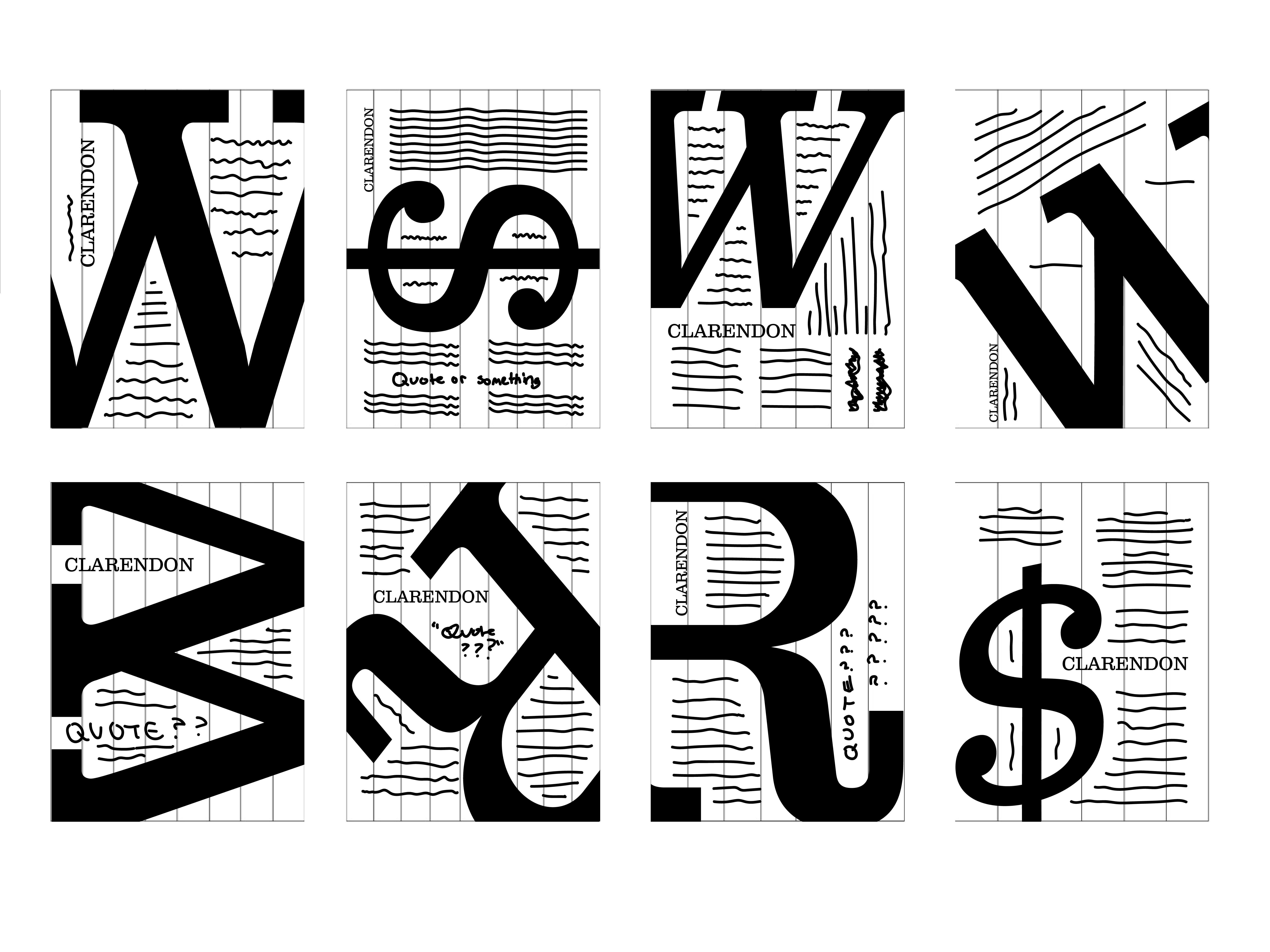
I started this project in 2021, still in the process of learning typography, and wanting to reflect the Wild West and the famous “Wanted” posters. I reworked the composition multiple times, but soon realized that the dull colors and lack of texture made the piece uninteresting. I changed the colors to a more Southwestern color palette to add interest and contrast, which I thought meant I was finished with the poster. I left it that way for a while.
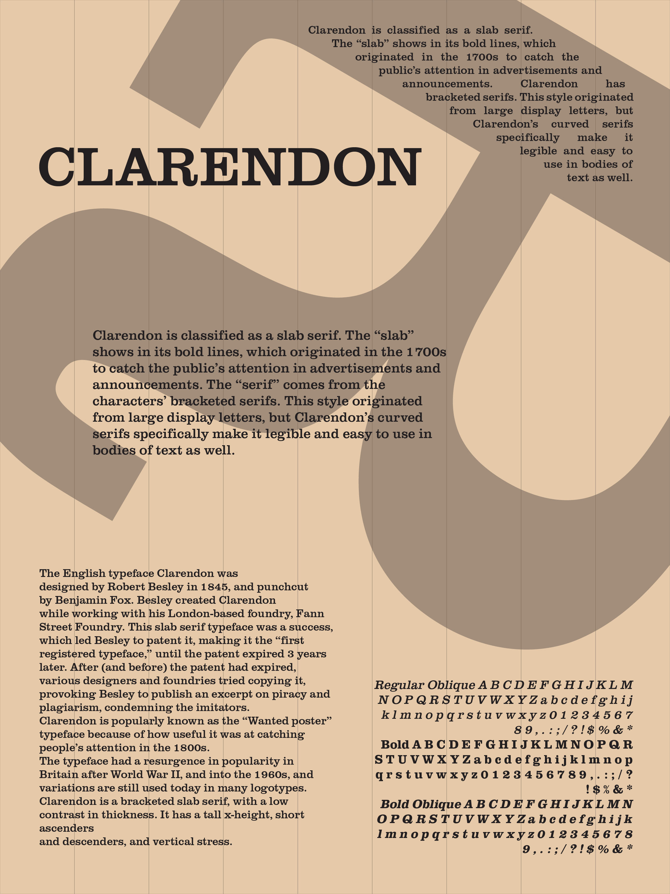
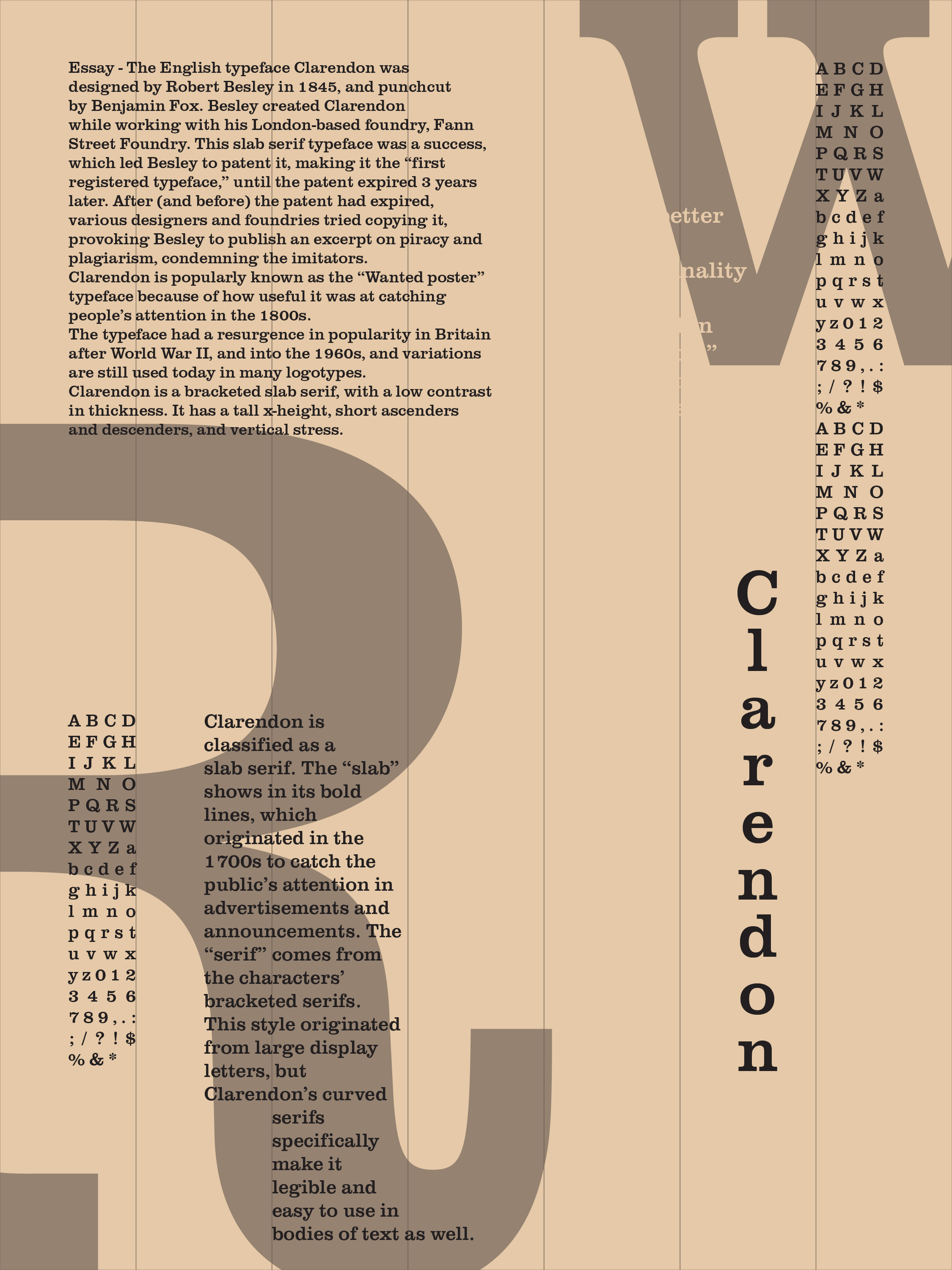
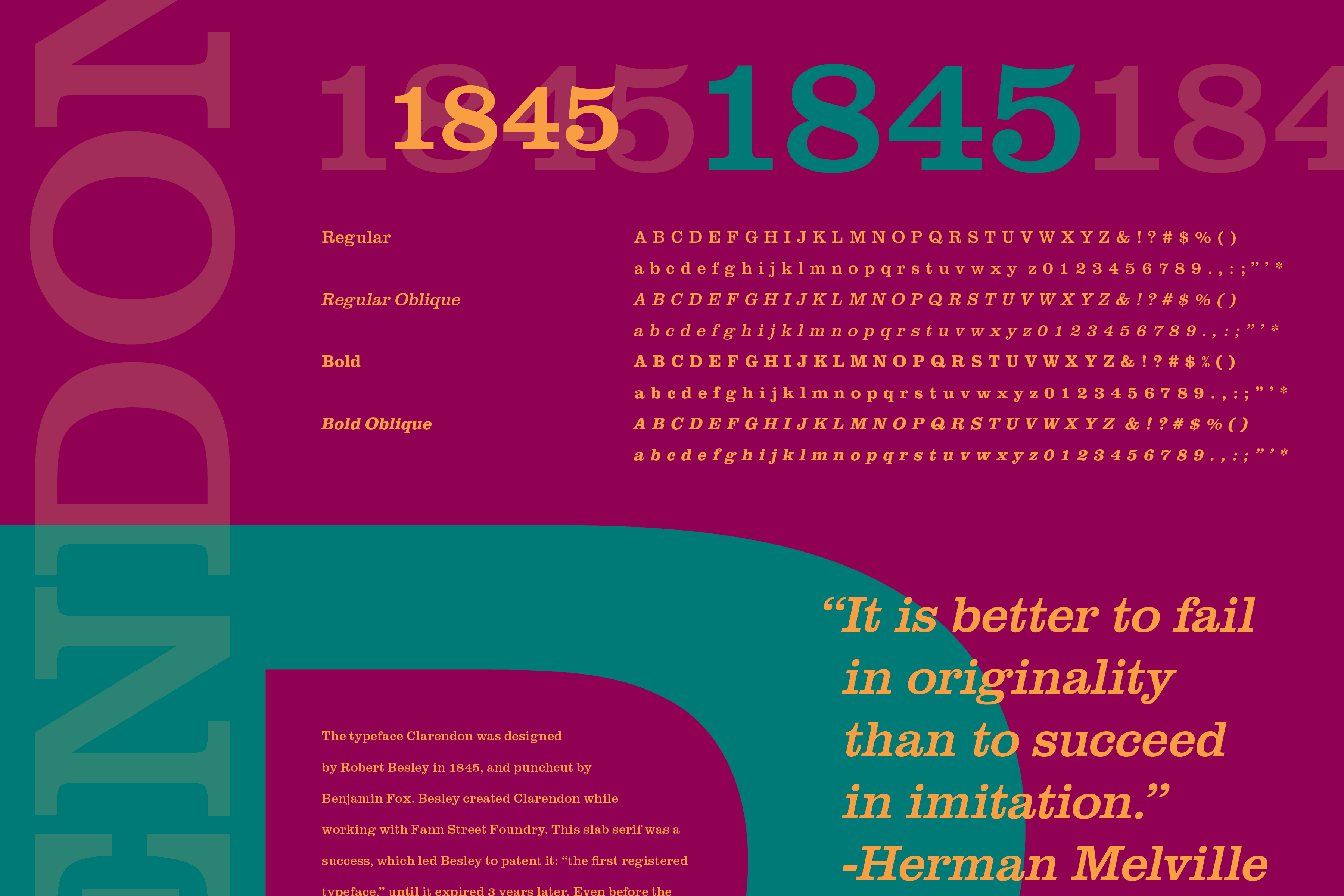
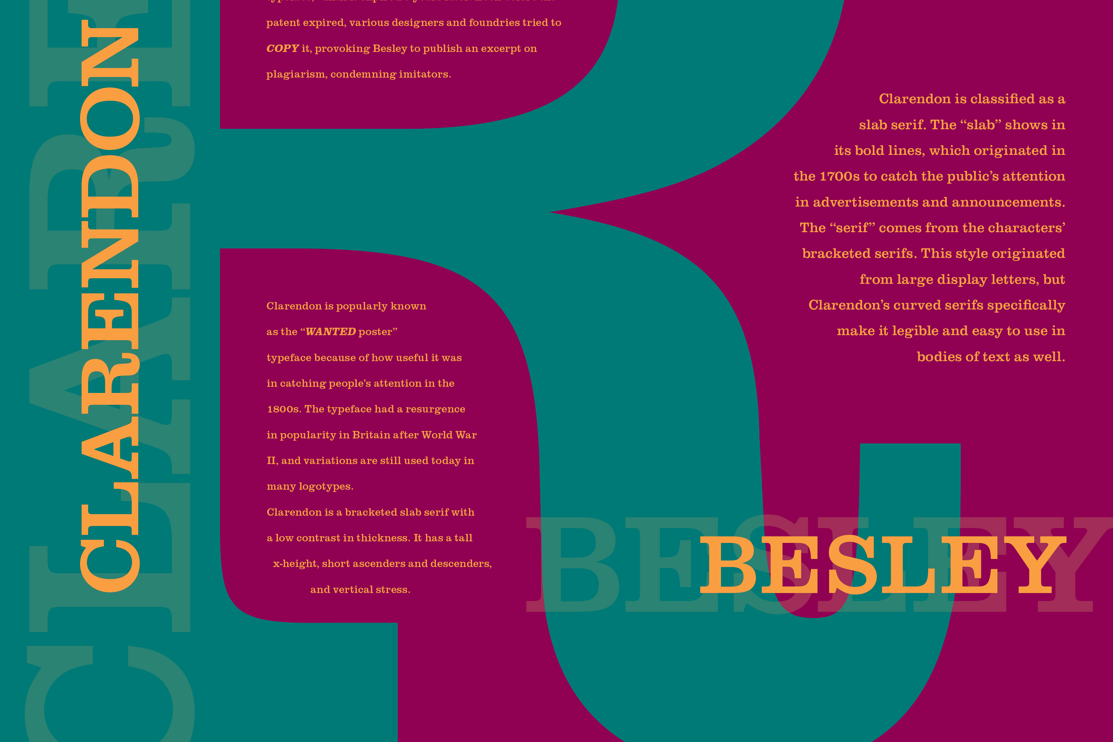
In 2022, I had learned more about typography – especially the importance of consistent leading – and looked back on the specimen. After a reapplication of the contents with consistent leading, it was finally complete. The composition was balanced, the colors were vibrant, the information was clear, and the type was consistent.