Feast on a Budget
Branding

Goal
After working with a team to envision Feast on a Budget – a nonprofit program with the goal to teach nutrition and cooking to low-income families in Austin, Chicago – the branding for the program needed to be visualized so that promotional marketing could be made to raise awareness of the new resource in the area. It needed to be family- and child-friendly, genderless, and promote healthy diets.

Solution
Feast on a Budget's logo was simple and to-the-point. The audience wasn't looking for excessive flourishes to distract or confuse them, so a rounded logotype was the best choice.
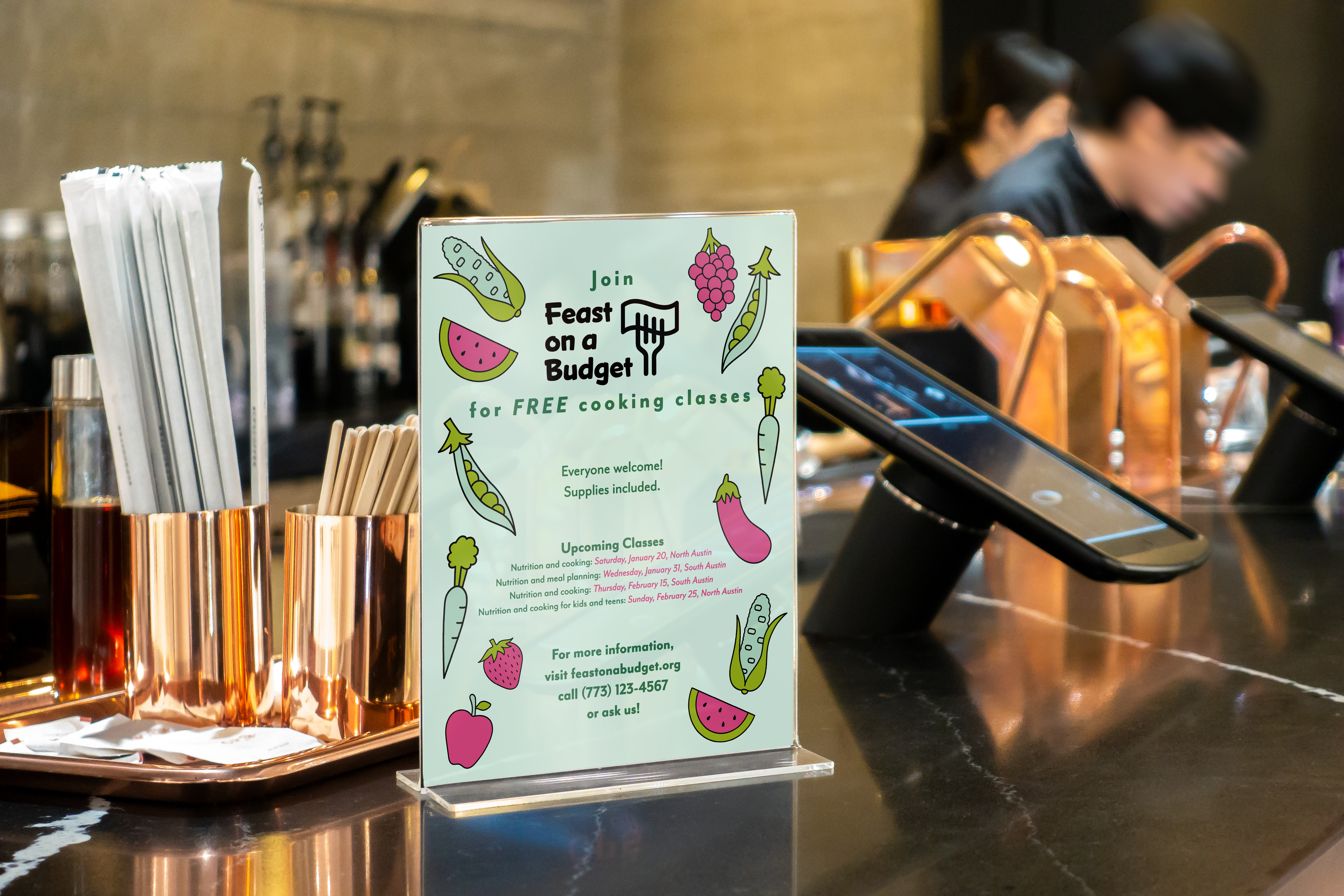
The color palette for the visuals was based on fruits and vegetables, roots, and gardens. The rich purple comes from cabbages, eggplants, grapes, blueberries, and other healthy foods. The green is pretty obvious: leafy greens, starchy vegetables, apples, avocados, and basically everything else.


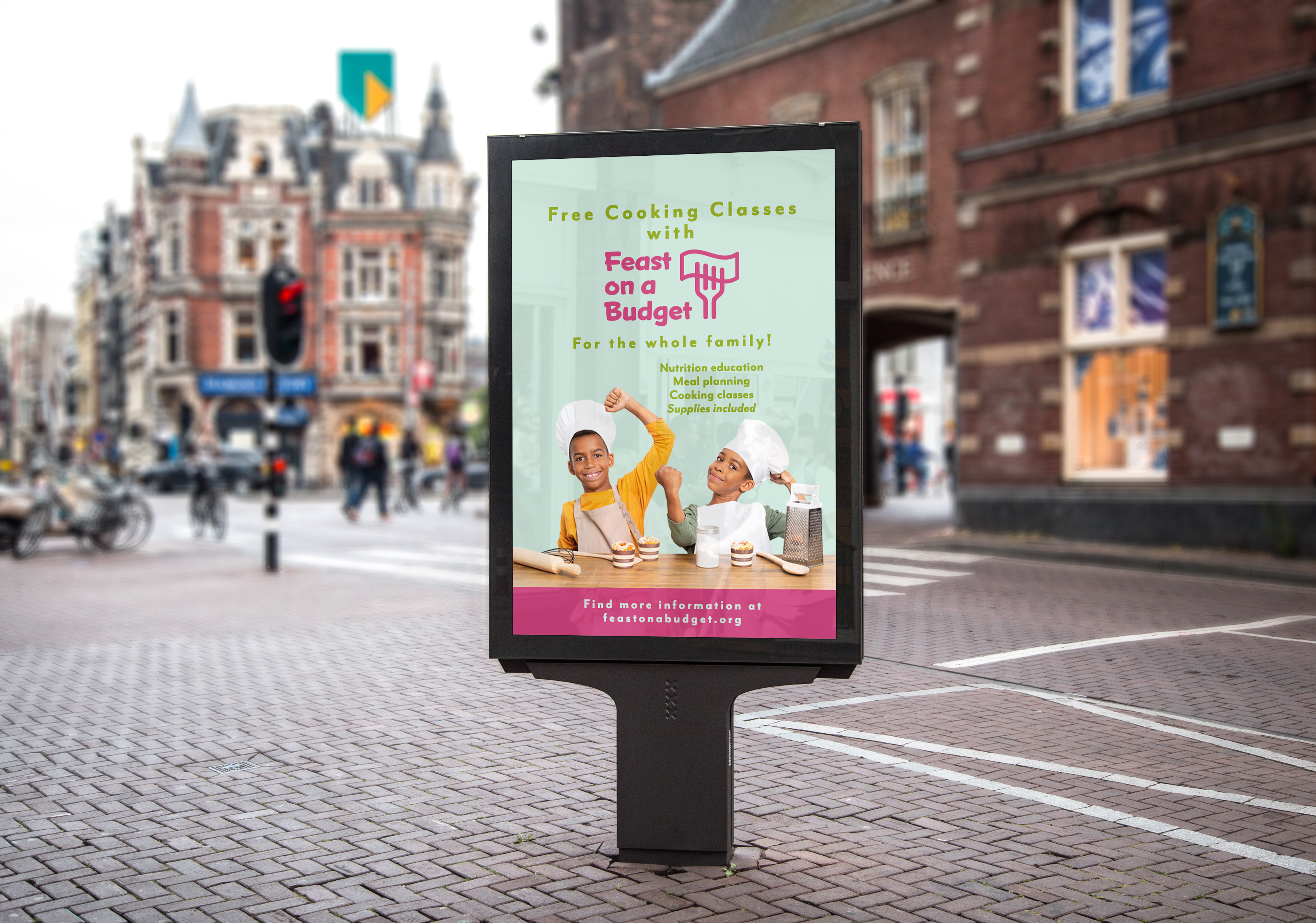
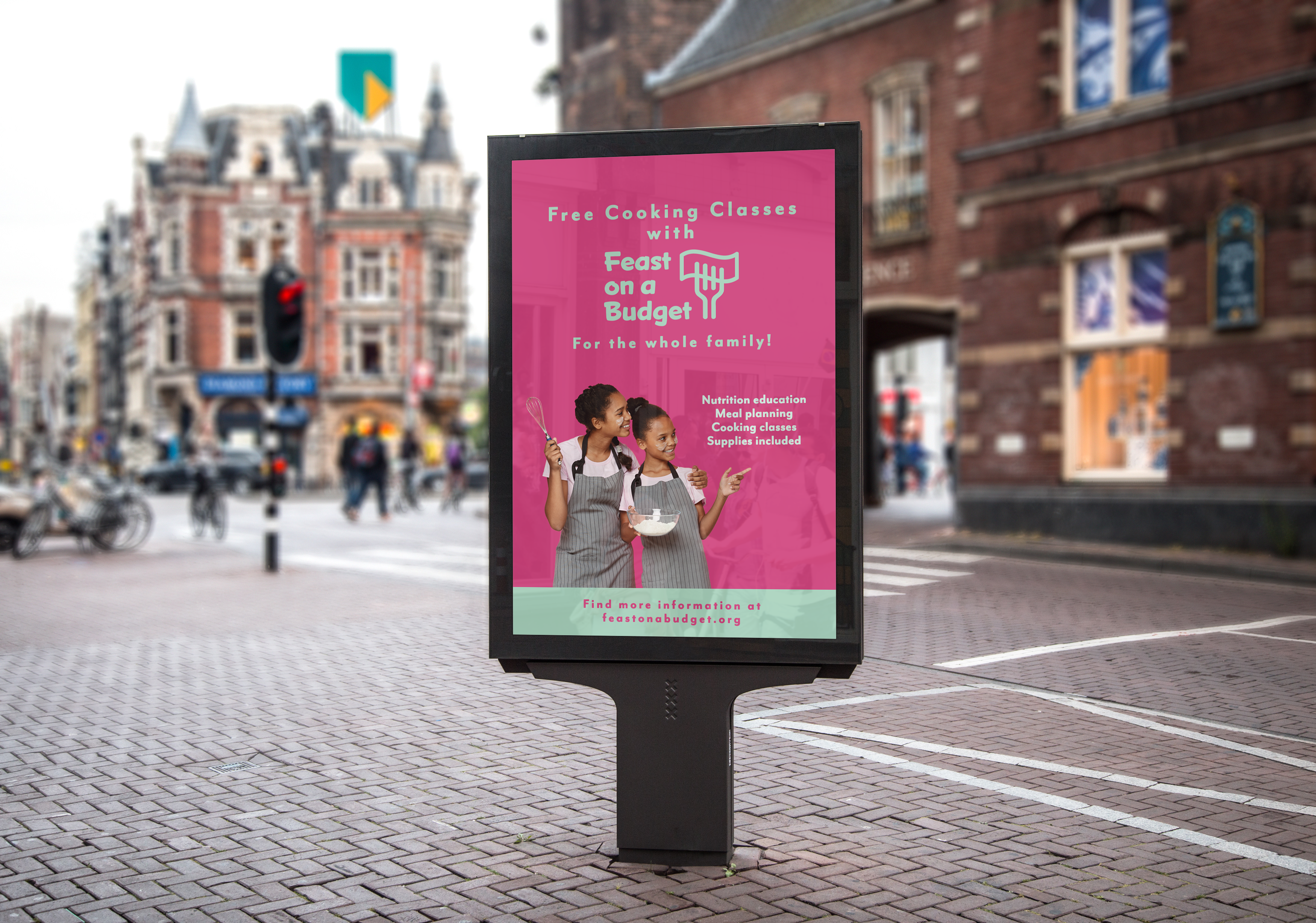
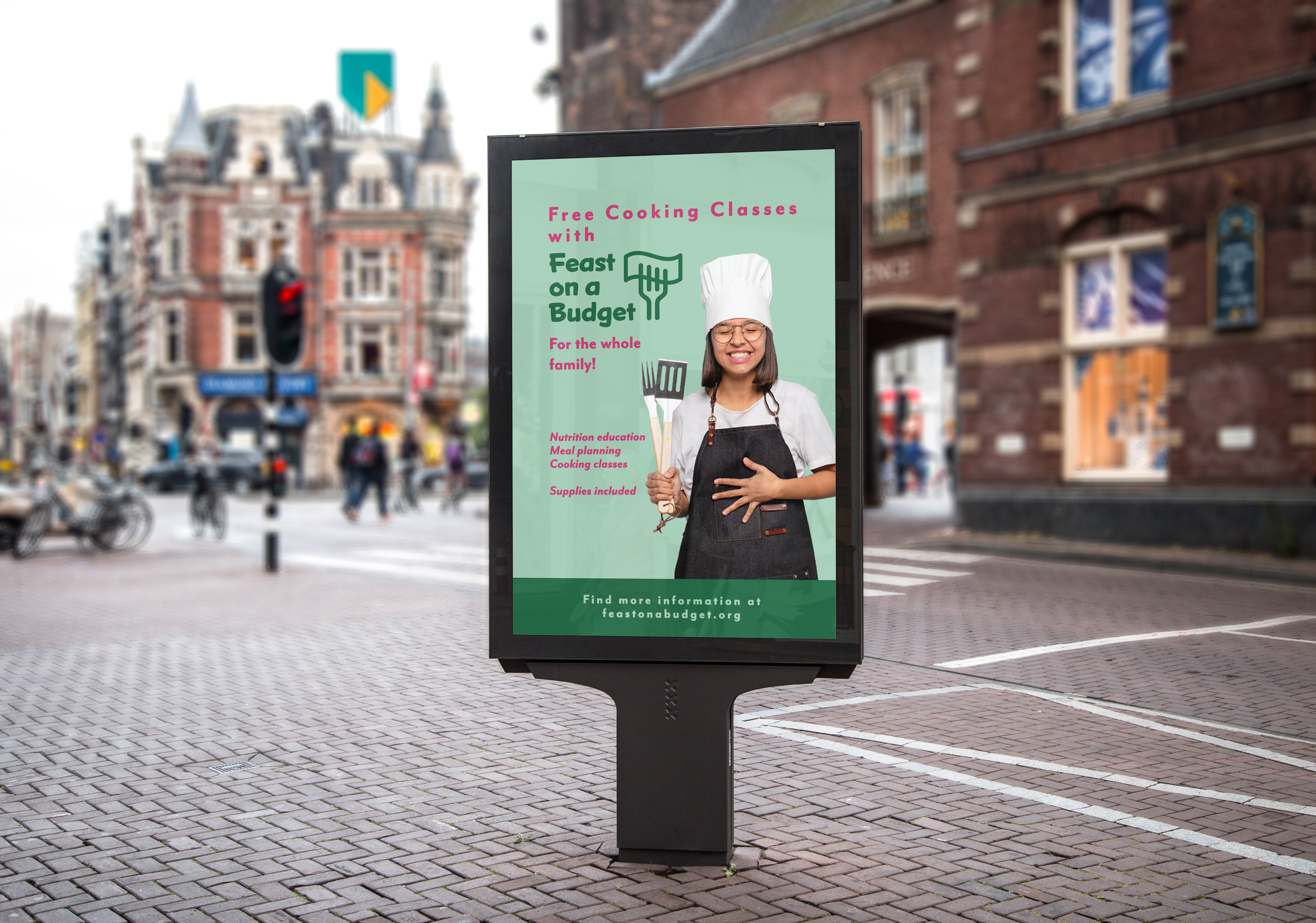
For the marketing, inclusivity and joy were the focal points. It was important for people to know that this was for them, and that their kids were welcome too, if they had any. Intimidation and hesitation were the last things they should be thinking of. Often, resources and space are limited, which deter people from joining or returning, so it was important to emphasize that that was not the case with Feast on a Budget.