Helvetica
Packaging
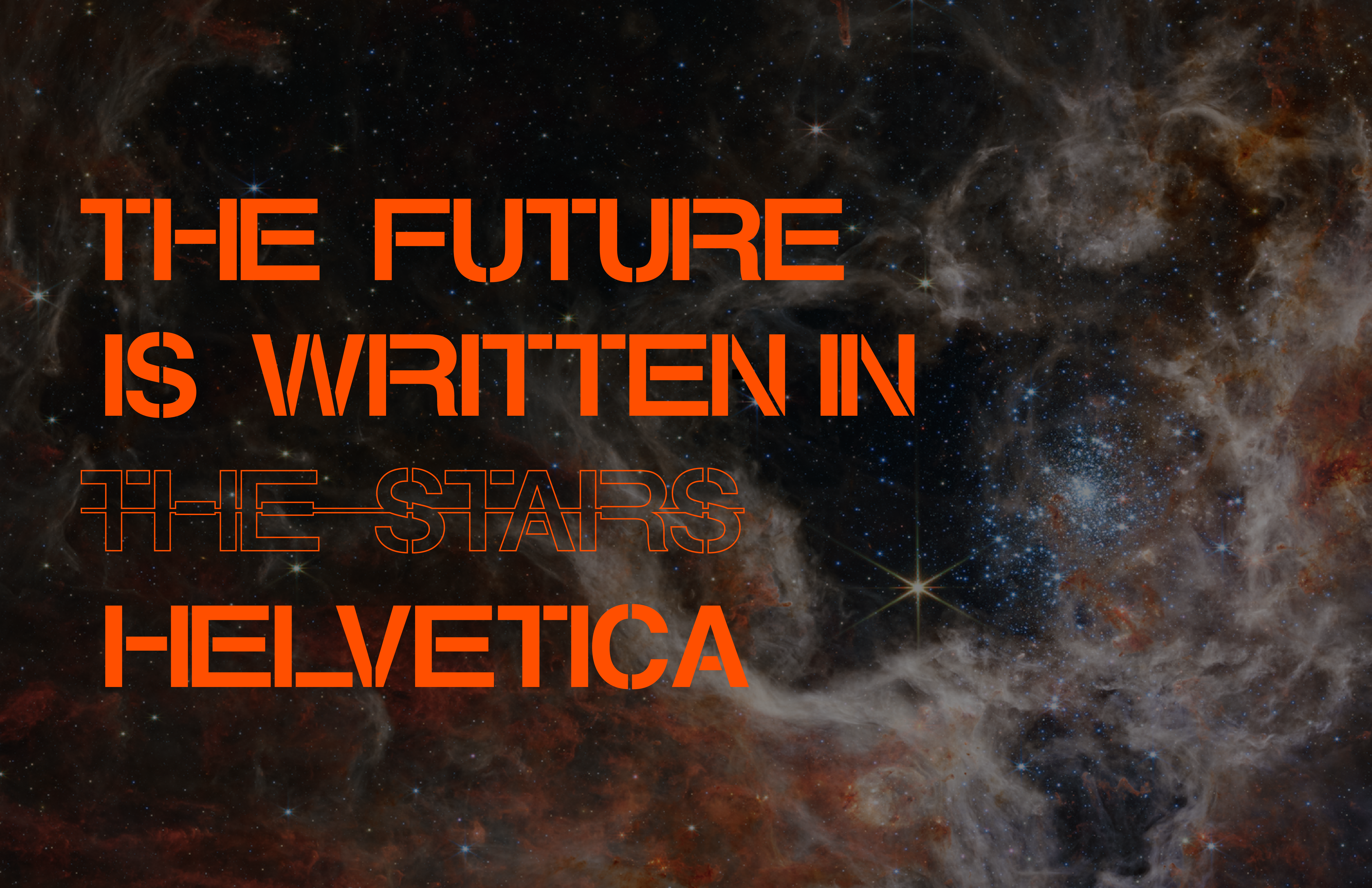
For this project, I aimed to make packaging based on a very famous typeface. Helvetica was created in 1957, and was considered revolutionary for graphic and type design. Since then, many other neo-grotesque and simplified sans-serif fonts have been developed in hopes of taking type design to the next level. However, many designers have agreed that nothing has “beat” Helvetica in its beauty and utility.
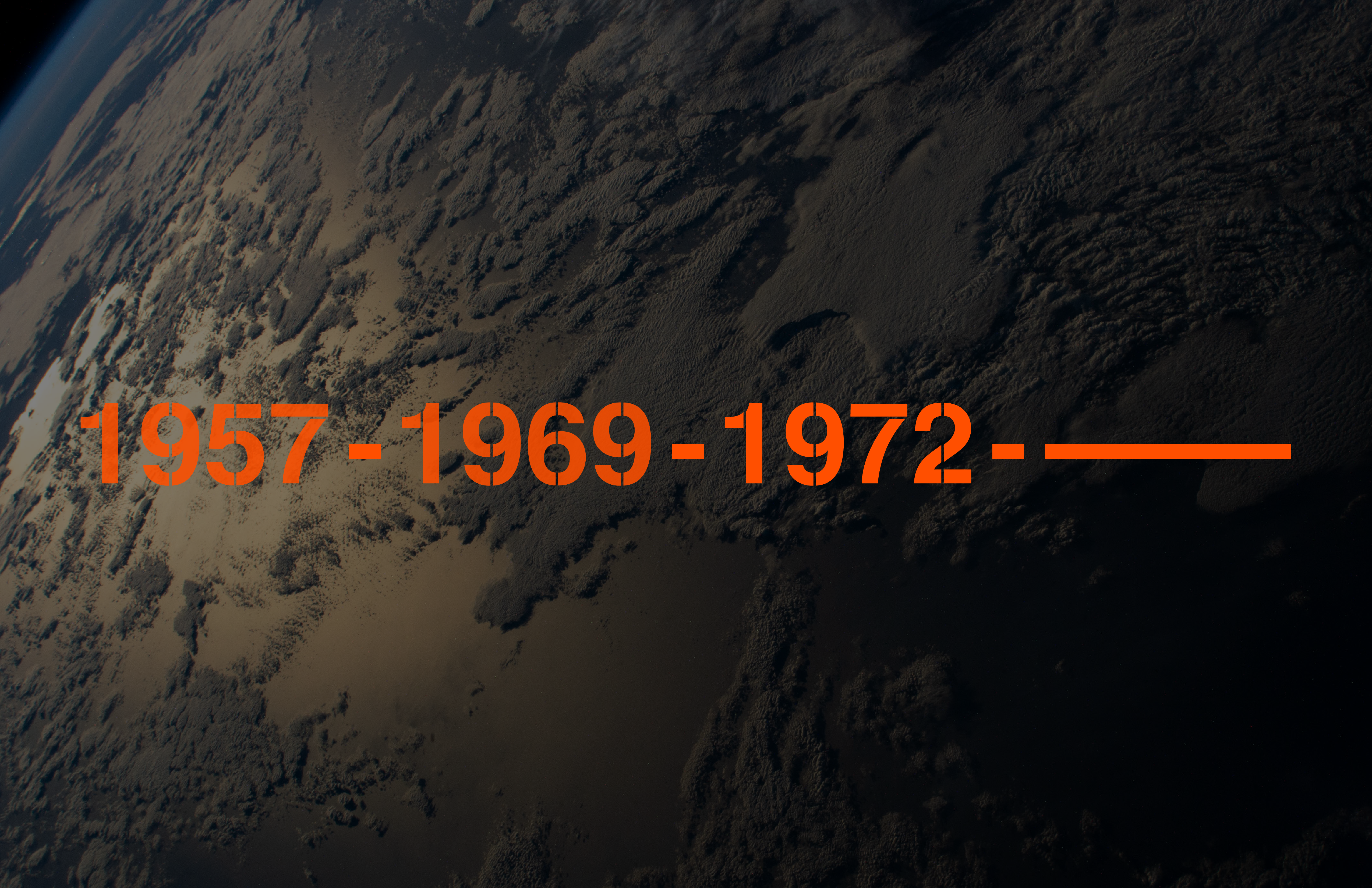
In 1969, humans traveled to another celestial body for the first time. This revolutionary event meant we were living in the future. From 1969 to 1972, there were six trips made to the moon and back. Since then, humans have not gone further than the International Space Station and Earth's orbit.
In both cases, advancements were made, and their potential was met, but nothing else came out of either. Nothing has “beat” Helvetica, and humans haven't traveled further into space.
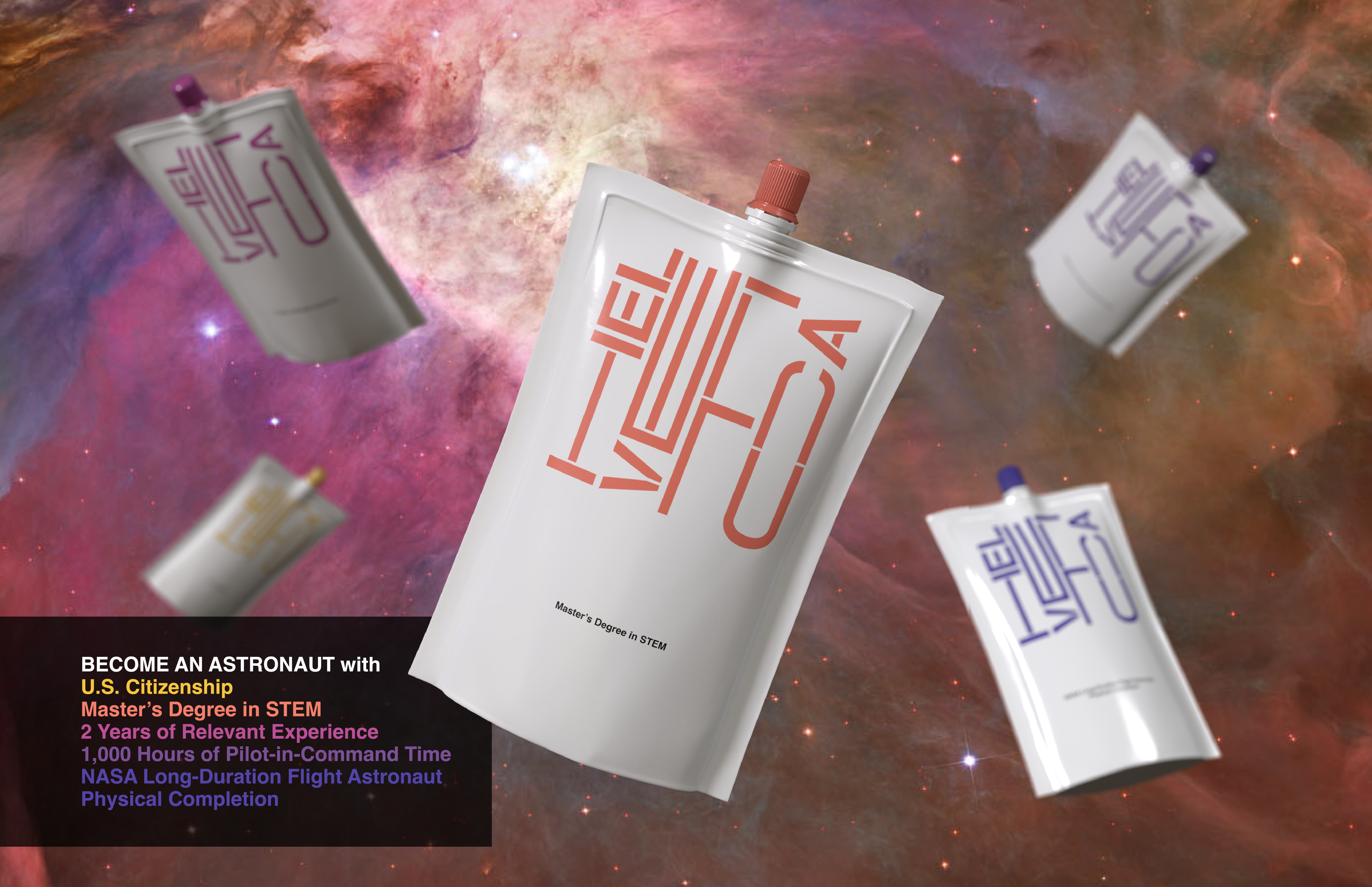
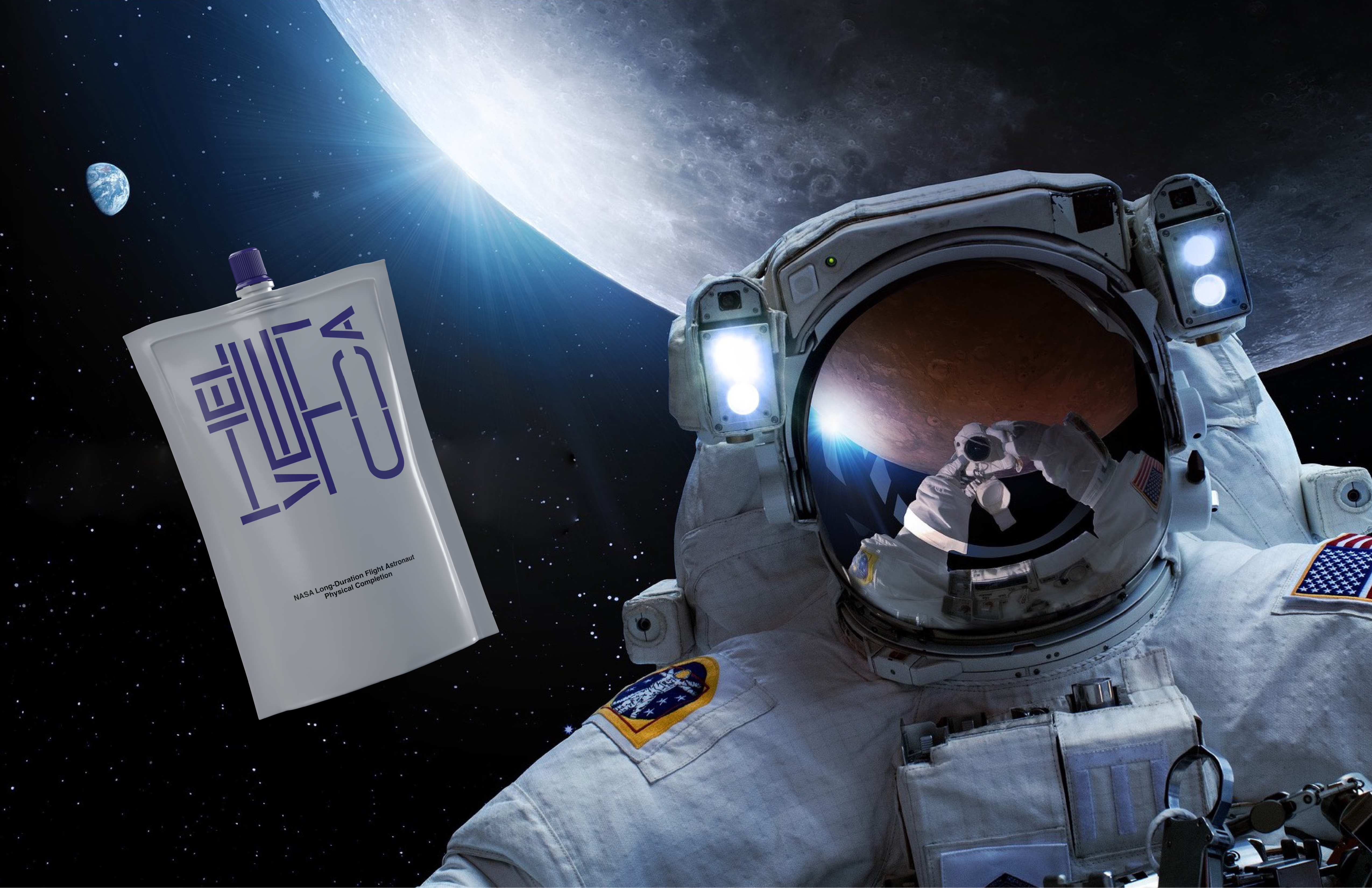
To me, Helvetica and space travel are similar. That is why I designed a brand of astronaut food named HELVETICA. The food isn't your average carrot- or chocolate-flavored paste though. It helps consumers become astronauts by giving them the qualifications to be astronauts: U.S. citizenship, a Master's degree in STEM, 2 years of relevant professional experience, 1,000 hours of pilot-in-command time, and completion of the NASA Long-Duration Flight Astronaut Physical. Current astronauts can also consume HELVETICA to fine-tune their skills as they wear off with time.