LLP Rebrand
Branding
Problem
The Living Leadership Program – a nonprofit organization funded by College of DuPage – needed an update on their visual identity after not having been altered since the early 2000s. This update was coming about post-pandemic, so everything about the identity needed to be applicable for both print and online marketing.

Solution
After referencing other entrepreneurial and leadership-focused organizations and graphics, a common cool-colored palette was found. To this, a pop of yellow was added: for joy, light, intelligence, ideas, and enthusiasm.
The previous typeface LLP used was Impact, which was narrow. To allow for narrow type while also improving the visual identity, the typeface Barlow was used, which has regular and narrow fonts.
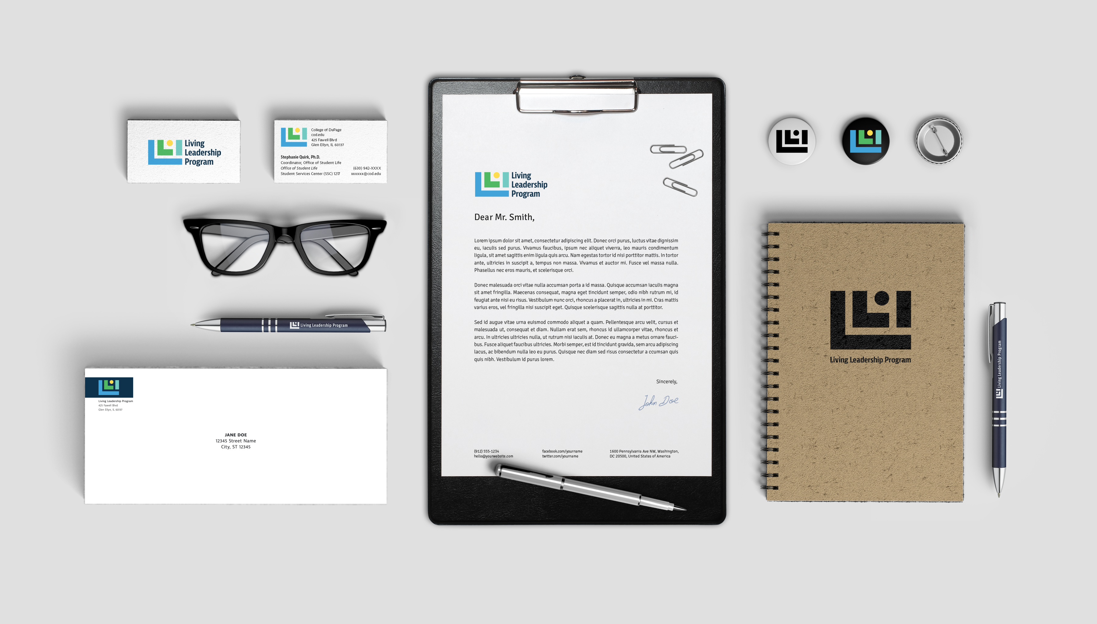
When making the new logo, simplicity was the goal, so that colors could be the focus and so that details wouldn’t get lost like they did with the torches of the previous logo. The rectangular shapes imply stability and responsibility, while the circle offers friendliness and community.
The simple shapes are also reminiscent of building blocks used in academic settings. After all, LLP is still an academic and interactive organization.
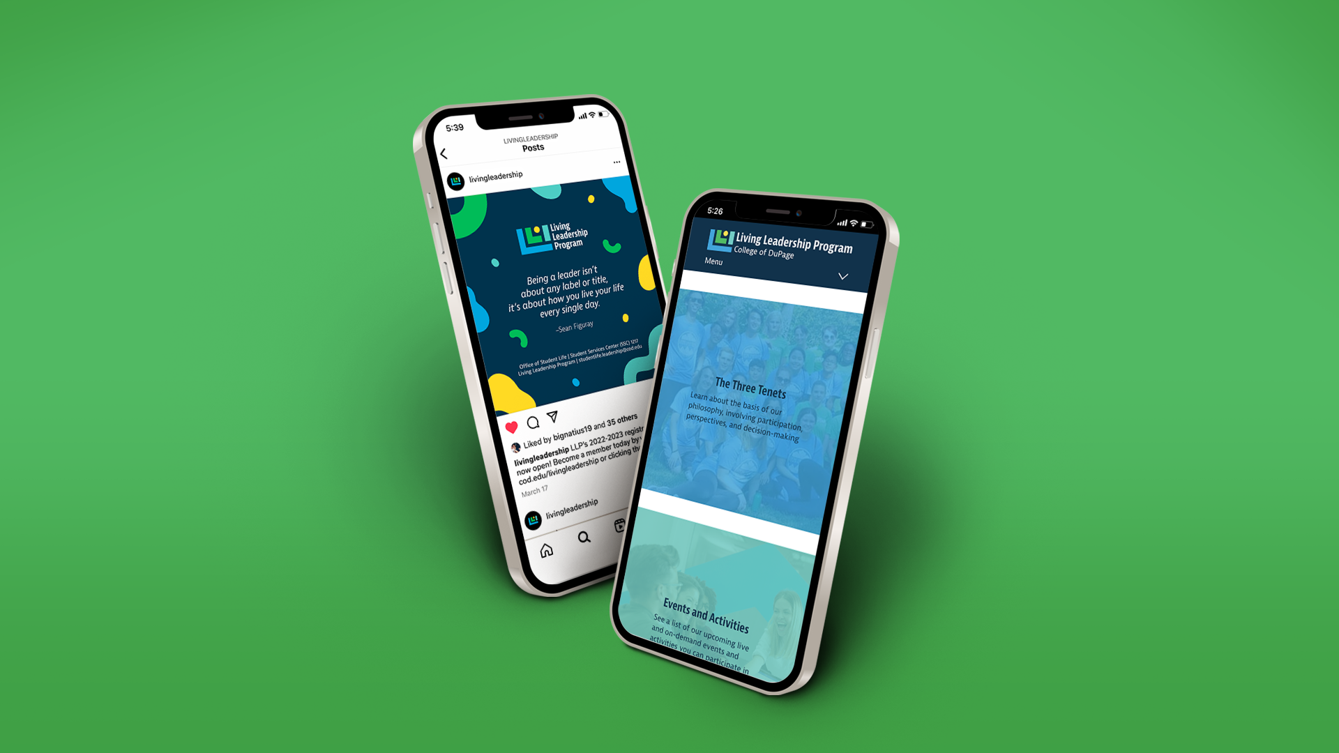
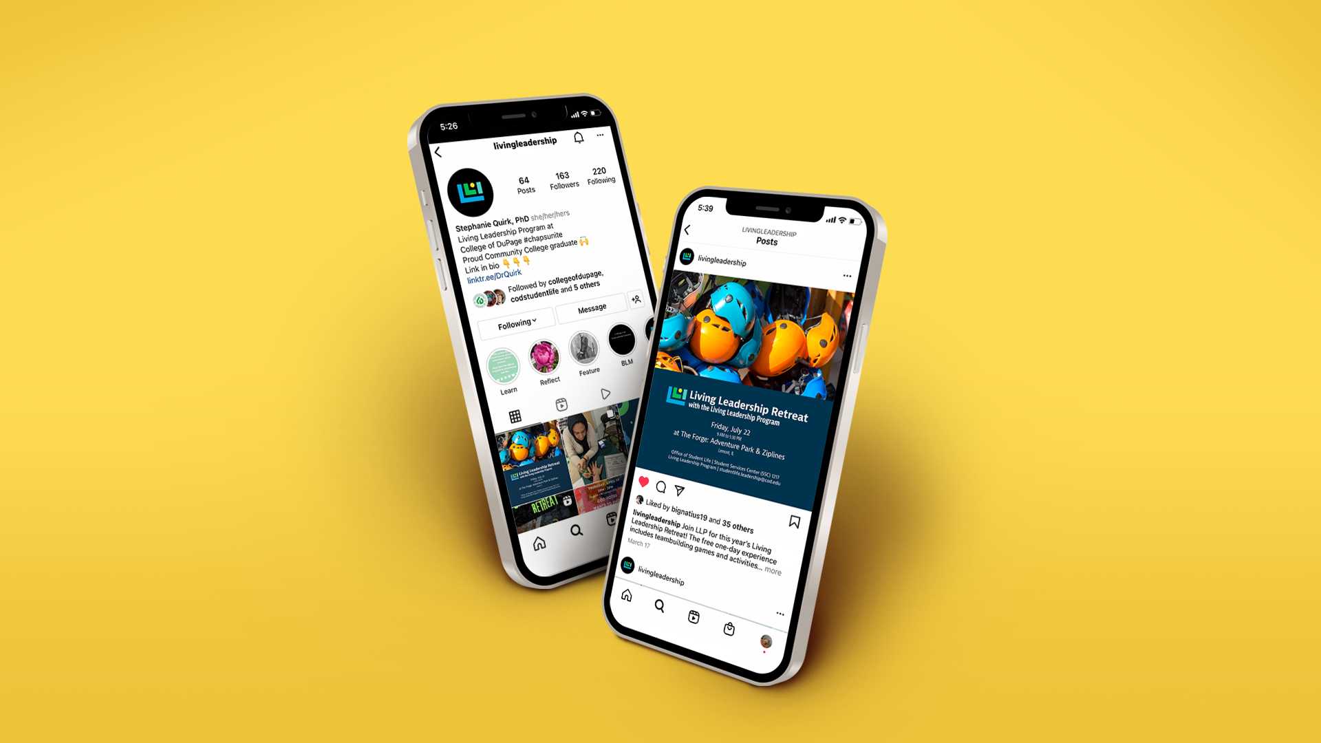
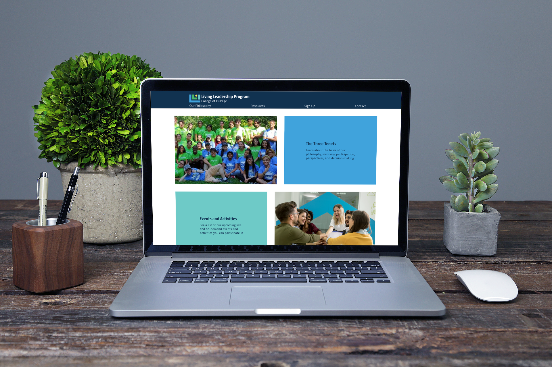
Along with designing a new logo and updating LLP’s color palette, I re-designed some of their pre-existing merchandise and other assets. I visualized what a new, personal website would look like, as well as an Instagram page and marketing that would be featured on it.
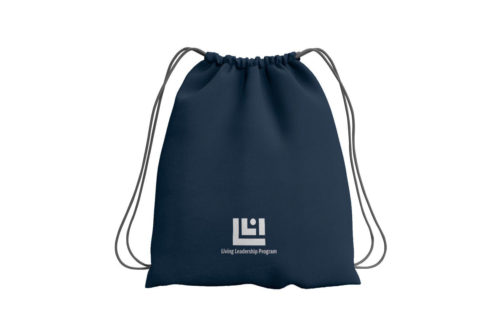
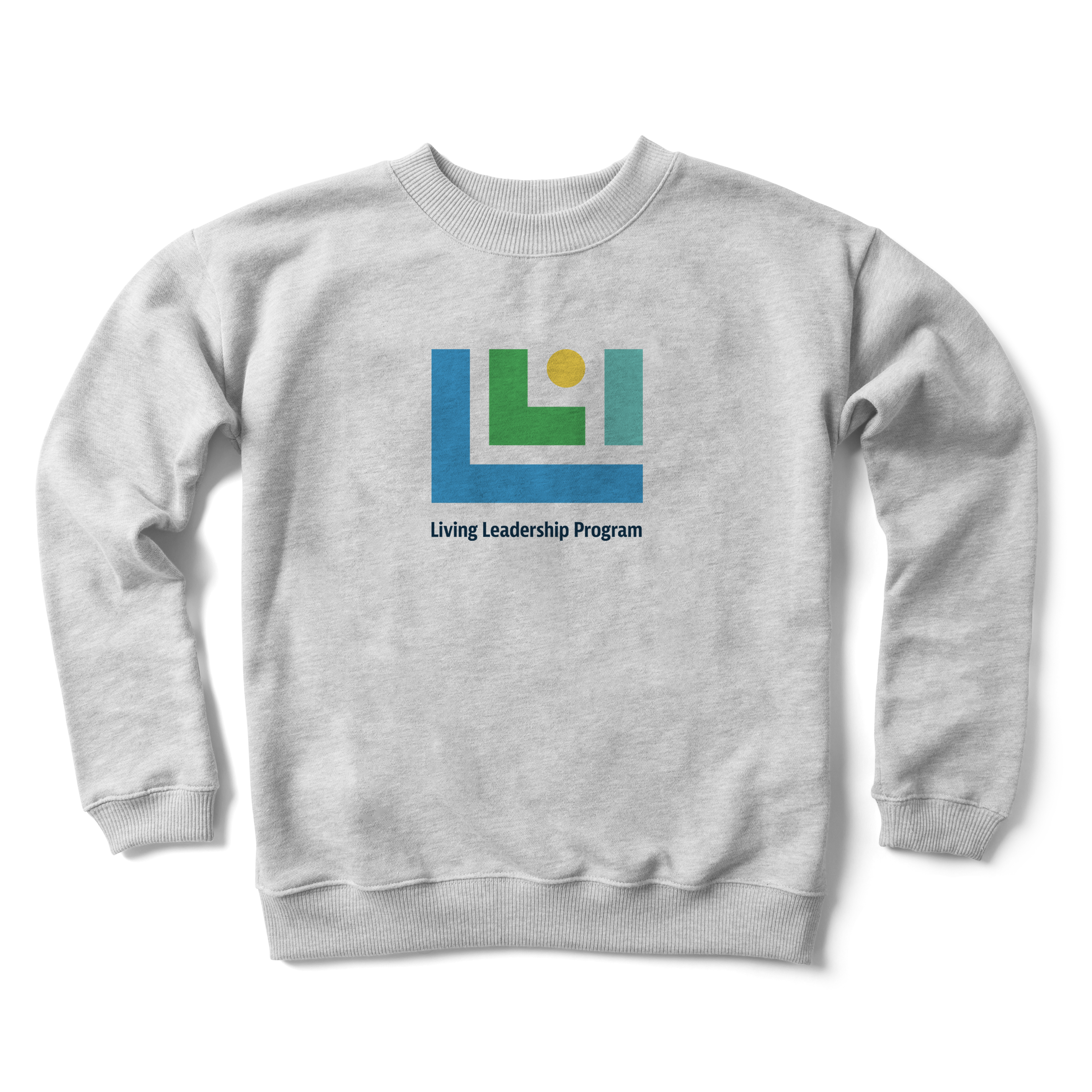
LLP gives its members merchandise when they join the program and during special events, so I updated the existing water bottle and string-bag, and designed a brand new sweatshirt and tote bag. Members can now enjoy the new merch and express their pride in being a leader.